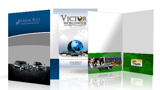
The Presentation folder is one of the most loved marketing tool to represent a business to target customers. Just like the business cards, these folders are the first one that the potential clients get noticed to know more about your business that you have and what you can do.
While designing and printing presentation folders, one small error can actually make 100 to 500 mistakes in terms of printing of these folders, depending on your order. In order to save the cost from a complete new print job, make sure to avoid these common mistakes to produce the best results:
- Inappropriate Space for the Logo: In designing presentation folders, if a logo is too nearer to the design, it will not create much impact on the eyes and thus distracting your attention. In the printing process, sometimes closer elements mixed together and makes it unclear. So a logo must be given considerable attention by giving it an appropriate whitespace. Also, your logo must be some inches away from the boundary of your folder to avoid the chances of cutting off during printing.
- Problematic Fonts: Every typeface does not equally look good and some fonts won’t produce nicer results when imprinting the product. Elegant and fancy fonts are difficult to use in foil stamping and embossing. When designing folders, make sure that fonts must neither be too small nor too close to each other, the size and space should be suitable so that clients can read it easily. Every printing company has different fonts so while placing an order, attach the essential font files with the design files for better results.
- Inconsideration to Design the Pocket: Cost of printing the pockets in presentation folders is in fact included in the printing of front and back cover. Printing of these pockets is mostly neglected with a view that this will save money. With printing in these areas, you can create striking designs for your customers with no extra charges. Folder pocket is a place where you can imprint contact information, colored pictures and other important material that you may have not been able to add it on cover.
- Not Understanding Color Differences: For imprinting presentation folders, your images must be ready to be printed. Failure to do so can create unexpected and pricey mistakes. You must understand the difference between RGB, CMYK and PMS. When placing your order, the file must be in the relevant format so to avoid color conflicts.
- Using Low Resolution Images: A common mistake made by most of the people is sending low resolution images for printing. When you place an order, your image must be of higher resolution to get the best results in printing.
- Neglecting Contact Information: You have crafted the most beautiful presentation folder, but forgot or omit to add contact information. The recipient finds your product or service attractive and wants to contact you, but has no idea how to get in touch with you. So your potential client cannot take much action. Email address, phone number and a website URL in a design is a must-have. The inside pockets can be used for this purpose to keep the front cover striking and expressive. If using the business card slit, you can omit the contact information since the card contains all the details. As some people are in a habit of losing the business cards, you can place the contact details on a folder to avoid losing clients.
- Picking the Usual Designs: Rectangle shape folders are quite common that most people use so try some different shapes such as wave or a zigzag pattern to show uniqueness. Exclusive designs will not only make you prominent among your competitors, but will let your customers know how creative you are.
- Neglecting Permanence: To make presentation folders effective, they must be durable. Your clients will never hold those folders for a longer time that have been worn out. For permanence, you should use rounded corners. With square corners, your folder may get damaged or torn. Rounded corners keep your folders for a long time and also give them a distinctive look. You can also apply a protective coating to increase the lifespan of folders.
By following these simple points, you can avoid all such mistakes while printing presentation folders. Good printing companies save you from such mistakes and costs by providing you complete guidance about your design. Just talk to them about the available options to present your folders in the best possible way.


